Wednesday, 21 October 2015

Pitch Feedback (Simona)

Pitch Feedback

Overall the pitch went quite well and we displayed our ideas for our product; we explained what we wanted the artist to wear, our target audience and also how we each wanted our own ancillary products to look for our music video.

Some improvement are:-
- The production schedule was very vague, we included the dates we were going to film however we didn't include where we were filming and what we were going to film. This was not made it look as though we weren't organised enough to complete a detailed schedule but also a detailed schedual allows us to reflect on our own progress and see whether we have stuck with this production or not.

- Another key and very important part of the pitch we need to improve is the costume and synergy. We have stated again very vaguely what we wanted and that was all. To improve we will need to include clear images of the outfits we intend to use and explain how it is different from the stereotypical videos in the 21st century.

* For me personally, I will have to include a more detailed explanation of what I want my planned ancillary product to look like and how it will link to the music video.

Pitch

Due to losing our footage for the pitch, therefore we have decided to use these screenshots...

Monday, 19 October 2015

Production Schedule:

Production Schedule:

The filming sessions will hoepfully all be done during the half term between the 24th-31st of October; however if this is not done then we will film also on the Monday's and Wednesday's. 
The yellow box highlighted are the editing that we will do for our video; on the 25th November we will have to create a rough cut and finally finishing the video off for the deadline on the 4th December.


Sunday, 18 October 2015

Animatic

This is the first attempt of making an animatic storyboard; I think it went to the beat of the song (every 4 beats there is a shot change).

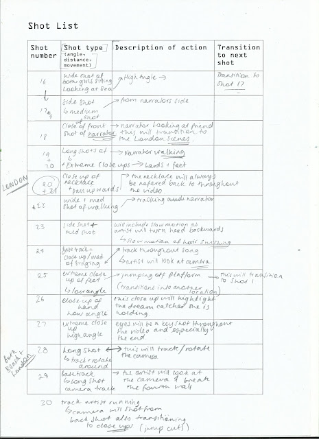
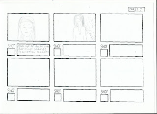
Storyboard and Shot List


Post Production

Draft Digipak/ Advertisement / Website

This is the style of logo, I have considered to advertise the artist; it is simple but modern and it looks effective both on a black background or white.

This is the CD cover that i have experimented with; I wanted to incorporate the dream catcher into the cover and thought it would look quite effective if it was added to the CD part. I will want to add images of the artist; however there will be one shot in London and another on the beach; each would have a different effect and style showing the idea of a hazy memory.


Synergy


Saturday, 17 October 2015

Social media

...

Risk assessment

Powered by emaze

Wednesday, 14 October 2015

Industry: Polydor Records

The artist 'Kai'li Klark' would be signed to the major record label known as 'Polydor Records', notable for being one of the strongest labels in the UK and we chose this label as it has signed artists within the same genre and similar to the likes of our artist. These artists are: Duffy and Sophie Ellis Bextor. The album would be available in stores and on multimedia platforms for download to help publicise the product and artist.


Polydor being a subsidiary of Universal Music Group shows that even though they seem to be a like an independent label, they still are owned but a global renowned company. Enabling them to still attract star-studded and represent them while in the process.


...

Costume (Simona)

Powered by emaze


As a group we have decided to have a maximum of 3 clothing changes. In an Ellie Goulding music video, there is hardly any change of clothing so we thought we would differ from this and do a maximum of 3. We have chosen this particular number after we have watched several music videos and counted the amount of times they have changed their outfits.

Our choice of costume is casual and simple - it reflects the life of an ordinary person. Also, after watching a few of Ellie Goulding's music videos we have realised her location and the lyrics of her music video are the main focus point.


Task 24: Initial ideas for the design and layout of the Digipak

For my initial ideas for the digipak, the album consists of the notable logo of the artist which is her name in a stylish font in black on a white background to help amplify and standout, appealing to the audience just with a first glimpse. The album cover itself which have the imagery of the artist with a close up like the prototype below, with wind blowing in her hair to provide an edge of what emotion is to come from the song as the artist looks toward what is perceived to be a horizon for better things to come.

The inside would be simple with the disk having a slight retro effect with the artist name only on the cover on a black disk with a white font, and the inside art/booklet would consist of a notable synergy which would be seen throughout all the work which is the dreamcatcher earrings just allow the audience to understand that dreamcatchers is the artists trademark aspect. 


Audience 2

Audience 1


Shots Inspired for Video


Location In London for Our Video


Wednesday, 7 October 2015

Examining Ellie Goulding's website

Ellie Goulding's website is simple; it consists of neutral colours and has all the necessary stuff needed for a fan to either purchase her music, listen to her music or attend her tours. It gives all the information needed and also alerts her fans about upcoming songs and the exact date of it. Her website choice suits her actual music videos, which are also simple and not too vibrant - this helps show her own sense of style.

Analysis of digipak/CD

Analysis of 'Beating Heart' by Ellie Goulding

Post 17: Annotating Our Song: Beating Heart (Simona)

Beating Heart 


Task 18: Analysis of the digipak/CD

After making our final choice for which song to choose, we opted for 'Beating Heart' by Ellie Goulding. While analysing the single cover for the song, we found links between the movie and the album cover which consists of very similar aspects.

As you can see below in the picture, Ellie Goulding has a significant tattoo which are three birds and happens to be the same tattoo the protagonist of the movie has, showing the link between the two. Instantly causing the audience to realise the song is for the 'Divergent' movie.

Another factor that we analysed was the blue striking light behind her name and the font her name is written in. Firstly, the blue striking light behind her name is the exact same to the blue striking light behind the Divergent title but the font that is used for her name is different and links to the artist herself as other various albums for hers have similar fonts. This allows Ellie Goulding to have her own input on the album cover so the public is aware.

The dark lighting on the album cover is the same as the lighting on the movie soundtrack album, again linking back to the film by applying the same effect on her album. Moreover, Ellie Goulding's style reflects back to the song with her black nails and black top to show the sorrow emotion of the song.


Task 17: Analysis of the original video

Powered by emaze

Obtaining copyright permission


Tuesday, 6 October 2015

Post 16: Final song choice


As a group we have chosen the song Beating Heart by Ellie Goulding, particularly because the song is soft and quite slow which might make the lip syncing easier for our artist. Also, we think this song is perfect to relate back to the audience.

Them  music video we are aiming for relates back to the original music video by Ellie Goulding  a lot, but setting wise we have aimed to go for a city atmosphere. Whereas, in the actual music video it is relating back to the scenery of the film Divergent, so locations like forests are used mostly giving off a rebellious vibe. Unlike the actual music video that constantly reflects back to the film divergent, we will be making our own storyline which will be shown through the location choices, similar to which is shown below:


Moreover, our artists style will be more colourful and stylish compared to Ellie Goulding's choice of clothing. We want our artist to look more vibrant and be easy to compare with other teenage/adult style nowadays - this will be beneficial whilst we reach out to our core and wider audience. 


Something similar to this, as it looks simple but yet trendy. 

Monday, 5 October 2015

Post 14: Blogging Health Check 1


For the my first health check, I have done quite well but I quite disappointed that not all my blogs are to the best standard they could be. Getting 14/20 is an ok score but I will aim to make it near to full makes as I want the best marks for my blogging as well as Music Video.

-One improvement is to use a range of different and interesting ICT to post my work onto; so that it's a visual experience as well as lots of writing.
-And continue to keep on top of blogs and keep them to good standards.

Post 15: Shortlist of potential songs

1) Ellie Goudling - Beating heart

2) Ellie Goulding - Anything could happen

3) Emeli Sande - Heaven

Emeli Sande - My kind of love

Friday, 2 October 2015

Reflection on progress

...

After reading Rebecca's feedback on my blog posts, I'm pleased to know that I am on/above my target grade and that I am up to date with my posts. I plan to keep my blog posts detailed like blog post 8 - as Rebecca pointed out it was one of the most detailed posts. However, I need to be careful with my spelling as I have made a few spelling errors, so I will check over my blogs before publishing it. Also, I need to expand my ICT knowledge, by using Prezi less and using other ICT for blogging such as Thinglink.